
Why Poison Studio Keeps Winning Awards for Websites
- Sep 30, 2025
- 6 min read
Updated: Oct 1, 2025
When it comes to winning awards for websites, some projects earn recognition not just for visuals but for the fearless attitude behind them. Poison Studio is one of those rare teams that thrives on breaking norms, redefining user interfaces, and pushing design beyond what’s expected. Their latest project marked a turning point in the studio’s 10-year growth plan — and it didn’t just refresh their digital presence, it redefined who they are.
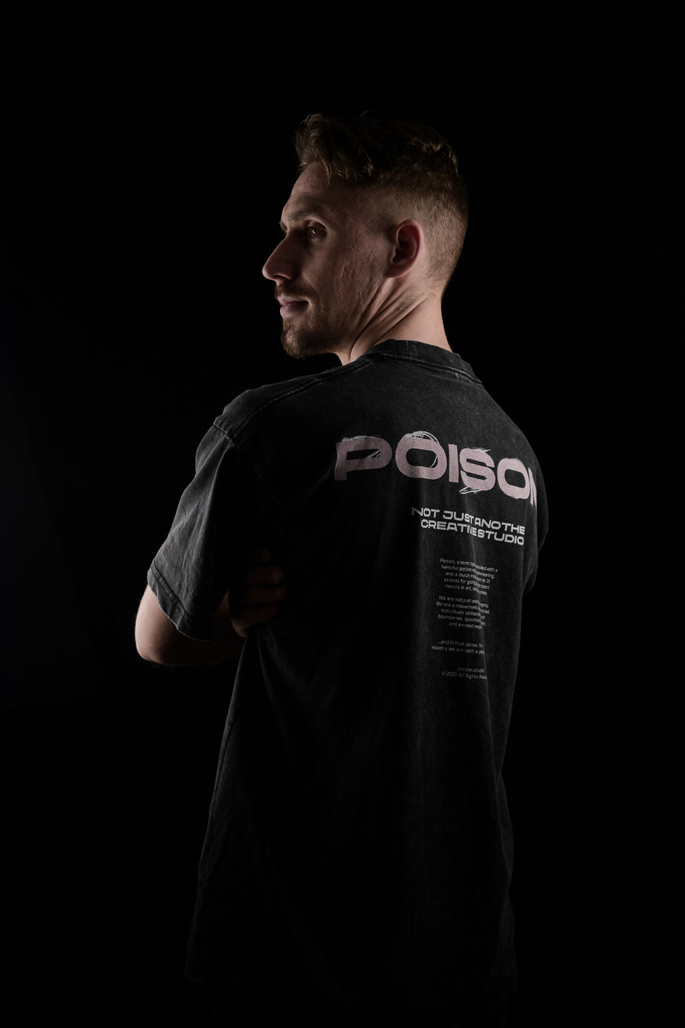
Based in Manchester, UK, Poison Studio is not your average creative agency. Founded by Adrian Trutkowski, the studio embraces the role of both “poison and cure” for the industry — shaking up conventions while delivering unforgettable branding and web experiences. With a string of recognitions including multiple VICE Awards, CSSDA wins, and Awwwards mentions, Poison Studio has earned its reputation as the partner for brands who want to be bold, weird, or simply unforgettable.

The Interview with Adrian Trutkowski (Poison Studio) – Crafting UI That Wins Awards for Websites
What inspired you to create this project?
This project was a part of the Phase II of our 10-year growth plan which began at the end of June 2023. The website launched alongside Poison Studio’s refreshed brand identity and was designed not just as a portfolio site, but a unique showcase of how our skills and crazy creative minds can be put into good use.
Back in Feb 2024, when Poison Studio’s previous website was launched, we had clearly established ourselves as the rebels in the industry — bringing crazy ideas to life and pushing boundaries of what web and brand could be, without giving a damn if people liked it or not. That allowed us to work with some incredible clients, founders, and organisations, who just like us, are not afraid of bold ideas and making a stir in their industries. Among some of them, we created and delivered some of our best work into Le Clubhouse, Lloyd Tichio Productions, and many more.
However, it was clear from the beginning that if we wanted to really become a trailblazer in the industry and push the limits of web and branding, we couldn’t just focus on the outsiders and those who would be “brave enough” to hire us for their projects. Thus Phase II of our growth plan, after making a strong statement with the original acidic green, quirky typography and grungy textures being in the centre of our branding, Poison Studio had begun a new chapter —positioning us as a more grown-up and trustworthy partner. However we did keep the same passion, boldness, and confidence that makes us who we are. I guess you could think of it as if a rock star had just finished touring around the world, topping up the charts, and then shocking everyone by becoming a CEO in the silicone valley. Yes, they had changed their leather jacket and ripped jeans for a suit and tie, but the tattoos, flashy hairstyle and the unmistakable fiery personality remain.
What was your main goal when starting the design?
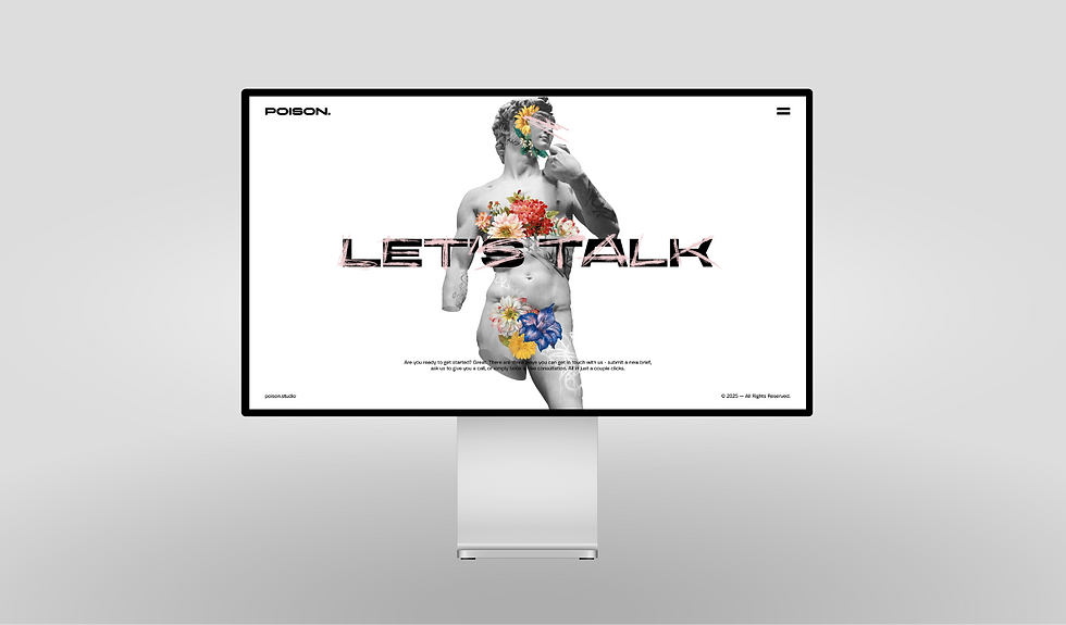
The number one goal was to strike the right balance in appearing more grown-up and trustworthy, without losing our unique identity that makes us who we are. There were also many cool features and interactions which we loved so much from our previous site that we had decided to carry them over to the new one, including the animated interactive illustrations on the homepage. It’s the small (and big) details like this that made our last site the success that it was, so the goal was to build on that momentum.
How would you describe your design process?
In a single word? Laidback. We knew we had to absolutely nail this one so throughout the entire process we weren’t afraid to revisit, question, or even scrap some of the initial ideas we had. There were countless reworks, improvements, and reconsiderations along the way, which to be fair, we were absolutely fine with. We wanted to make sure every detail was looked after and absolutely dripped with personality, from the layout of the project pages and hover interactions, to hand-animated elements and the icons in our custom video players.
Which tools or methods did you use?
As is the case with all our projects, we began with a pencil and paper, sketching out hundreds of layouts, compositions and designs. Then we prototyped everything in Figma, and once we had agreed on the design, we built the site in Webflow.
Obviously, the creative assets, such as illustrations, icons, or motion graphics, were created with the Adobe Creative Cloud apps.
What was your biggest UX challenge and how did you solve it?
Our website is highly interactive. Many of those interactions depend on how the user interacts with the device, whether that is through a mouse and keyboard, touchscreen, or any other input device. Therefore, the biggest UX challenge was to find a way to make the interactions work just as efficiently on mobile devices as they would on desktop.
A great example of how we overcame those challenges is the way homepage illustrations interact based on tilt via gyroscope in a mobile device or a tablet.
Which UI detail are you most proud of?
I think the entire UI is stunning and works really well. However, the hand-drawn hover animations on the homepage and menu links are my favourite.
How did you bring creativity into the project?
We tried to make everything as unique, but at the same time intuitive, as possible.
What was the most difficult technical aspect to implement?
There was a lot of custom coding required to make some features work. I’m no developer so those took me probably much longer than they would to someone with more skills and experience.
How did you approach SEO and performance optimization?
We stuck to the standard well-established practices, like optimising file sizes, proper heading tags, etc.
Looking back, is there anything you would do differently?
Not really. I feel like even if we had decided to try a different approach for anything on the website, we’d quickly pivot and end up exactly where we are now.
About VICE Awards
How did you feel about the scoring (UX, UI, Creativity, SEO)?
I feel like we got a fair score. The things we spent the most time and effort on scored the highest, which we are really happy about. Personally, I’m a big fan of the fact that there is a Creativity score in addition to the standard UX, UI, and SEO scores you’d get with other web design awards.
What does winning the Site of the Month Award mean to you?
Really proud. It’s always great when you put your skills, experience and passion into something and it gets the recognition it deserves. I’d like to thank everyone involved in bringing this site to life. I truly appreciate your input and this award is a testament to your skills and talent.
What advice would you give to other designers who want to submit their work?
Follow your instincts. Cut away the noise and follow your vision. At the end of the day, you are the designer, you got to this position thanks to all your hard work and a ton of talent, so let your experience guide you in your process. Don’t be afraid to try something new and push boundaries - that’s what will take your design from great to extraordinary. Also remember, the devil is in the details. The best ideas come from experimentation, so even if you feel you found the solution to a design problem, still leave that door open for a while - perhaps an even better idea will come, and when it does be sure to explore it!
Explore the Project
Final Thoughts
Poison Studio’s Site of the Month project is a perfect reminder that the best awards for websites aren’t given for safe choices, but for bold ones. With UI details that surprise, interactions that engage, and a philosophy that embraces being both rebel and partner, Adrian Trutkowski and his team continue to redefine what web design can be.
Ready to showcase your creativity?
Submit your website today and join the next wave of innovators at VICE Awards.


