Trionn’s Bold Vision: A Website that Won a Design Award
- Miodrag Canovic

- Sep 18, 2025
- 4 min read
Updated: Sep 26, 2025
When it comes to the world of design awards, every winning website tells a story of ambition, creativity, and innovation. Behind each project is a vision that sets it apart — and this June, Trionn did exactly that.
With a final score of 8.4, Trionn’s project earned the Site of the Month Award at Vice Awards. More than just a digital presence, the site reflects bold imagination, technical precision, and a storytelling approach that leaves a lasting impression.

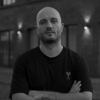
Design Award Interview with Sunny Rathod (Trionn)
What inspired you to create this project?
We needed to build a space online that accurately reflects us as a creative agency. We aimed to make something that does not just say it is bold and different but is so. Nature inspired us, particularly the lion, who represents courage, strength, and leadership. We wanted users to sense that strong "roar" when they landed on the site.
What was your main goal when starting the design?
Clarity was what we focused most on: we wanted to tell our story in an inspiring yet easily accessible format. Most importantly, it was essential that prospective clients get an immediate sense of what we do, why we're doing it, and how we can help them. We also desired the site to be an experience, like a portfolio piece—a lasting impression.
How would you describe your design process?
We combined research and imagination. We started by looking at how humans interact with agency sites—what intrigues them, what puzzles them, and where they get lost. Next, we brainstormed visual concepts based on our "digital wilderness" theme. Then, we went into wireframing, prototyping, testing, and revising until it all felt comfortable.
Which tools or methods did you use?
For the front end, we built the interface with React.js, which gave us flexibility and performance for a modern, component-based website. For animations, we used GSAP (GreenSock) to achieve smooth transitions, micro-interactions, and natural flow. For 3D graphics, we integrated WebGL and, in some areas, experimented with Three.js. This mix of technology helped us create a visually rich, technically sound, and optimized website.
What was your biggest UX challenge and how did you solve it?
The biggest challenge was achieving the right balance between usability and creativity. With a strong brand theme, it’s easy to get carried away with imagery. We asked ourselves repeatedly, "Does this improve the user experience, or is it just distracting?" We solved it with a clean navigation hierarchy and purposeful interactions.
Which UI detail are you most proud of?
We take pride in our micro-interactions—hover states, smooth animations, and transitions that bring the site to life. They add personality to the interface and reinforce our brand voice without overwhelming users.
How did you bring creativity into the project?
We infused creativity through storytelling. Instead of the usual "agency template," we used metaphors, bold imagery, and a narrative style that mirrors our personality. From the lion symbol to the wilderness imagery, everything was designed to transport visitors into our world of imagination.
What was the most difficult technical aspect to implement?
Ensuring performance with heavy visuals. Large images, animations, and transitions can slow down a site, so we optimized assets, enabled lazy-loading, and fine-tuned animations to ensure smooth performance across devices.
How did you approach SEO and performance optimization?
We worked on both technical and content fronts. Technically, we compressed photos, minified code, and kept the structure clean. Content-wise, we crafted strong messaging, clear titles, and targeted keywords. Our goal was to let design shine while ensuring both search engines and users could navigate easily.
Looking back, is there anything you would do differently?
If we were starting over, we’d dedicate more time to building detailed case studies for each project. The visuals are strong, but adding deeper storytelling around outcomes and client impact could add even more value. That’s something we plan to expand on in the future.
About VICE Awards
How did you feel about the scoring (UX, UI, Creativity, SEO)?
The criteria are clearly defined, which makes the process transparent. I appreciate the balance between design aspects (UI/Creativity) and usability/technical aspects (UX/SEO). The tiered awards also give motivation at different levels, and the numeric scoring adds structure to the evaluation.
What does winning the Site of the Month Award mean to you?
Winning the Site of the Month Award is a tremendous honor and a milestone for us. It validates our design philosophy and enhances our credibility as an agency. On a personal level, it motivates us to keep innovating, push creative boundaries, and deliver exceptional digital experiences.
What advice would you give to other designers who want to submit their work?
Polish your design: clean UI, strong visuals, and mobile responsiveness. Optimize for performance and SEO. And above all, bring creativity and purpose—whether it’s through a unique concept, an innovative interaction, or storytelling that makes your project stand out.
Explore the Project
Final Thoughts
Trionn’s success story is a testament to how vision, storytelling, and technical mastery can combine to
create a website that resonates with users and industry experts alike. Their journey demonstrates what it truly takes to build a website that wins a design award — creativity, clarity, and the courage to stand out.
Ready to showcase your creativity?
Submit your website today and join the next wave of innovators at VICE Awards.


